4 Tips for Higher Education Website Design
As a current college student, it was not long ago that I spent hours combing through college websites during my college search, and this was especially the case before I started to visit the campuses. The only thing I can recall three years later is the frustration and irritation at not being about to find the tuition or the fast facts. In this digital age, making an online impression is critical, so it is important for your college or university to stand out among the crowd. As someone who has spent many hours searching for the right school, a good college or university website is key to making a good first impression. Oftentimes, a bad higher education website design can deter the visitor from attempting to engage with your content. A major problem that web designers face is that sites can become outdated or become less effective as trends change. So as you are looking for ways to improve your higher-ed website and stay ahead of the curve, here are four ways that you can improve your college or university website.
1. The Experience
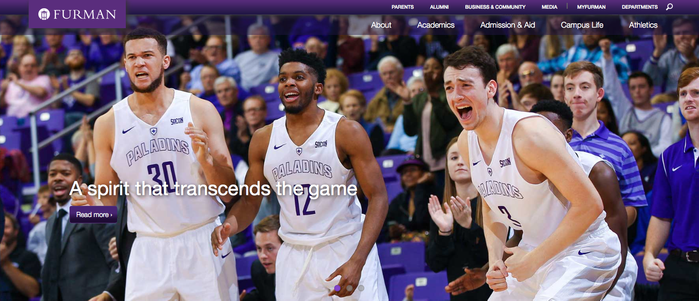
The era of the experience is upon us. People do not want to simply sit down and read your university website, they want to experience it. When creating the experience that your website needs, it has to be done in the perfect combination of serious and entertaining. The price of college is skyrocketing, and so the experience also needs carry an air of seriousness. This can be done in a strategic way to funnel interlopers to specifics pages. For example, this vivid image from Furman University captures the attention of the viewer and makes you experience the game from an outside perspective. It then funnels the reader into an article that discusses Athletics.
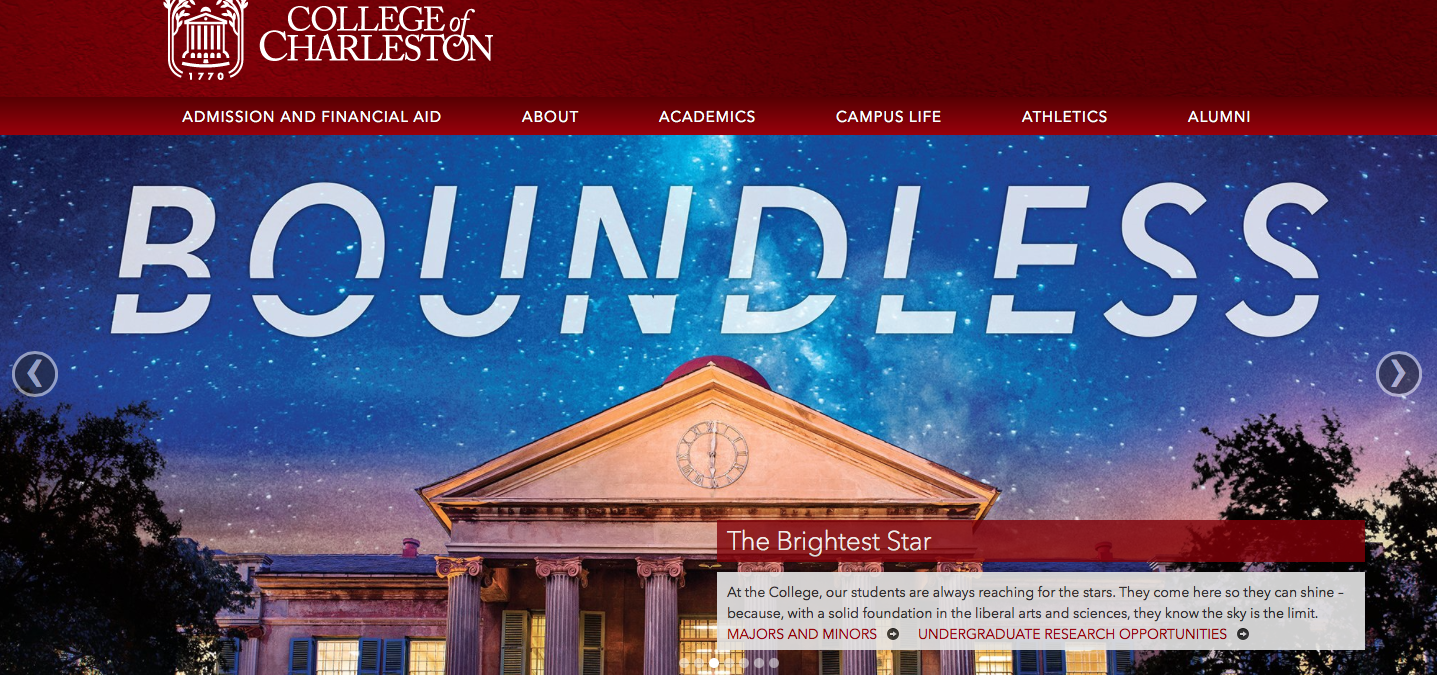
It also highlights the importance of professional photography, and in order to create a sensory experience professional photography is a must. Another example is College of Charleston, with this captivating image.
Now look at UNC Chapel Hill,
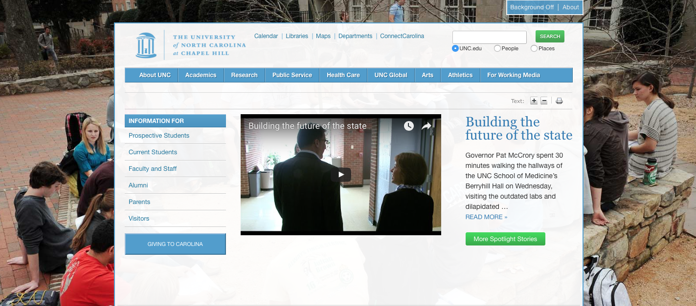
This image is not as vivid as the pictures above, and does not create an experience when the visitor opens the website. I think we can both agree that when there is an option to turn the background off, even the university knows that their website visuals are ineffective.
2. Content Hubs
What exactly is a content hub? A content hub is an all-in-one location on a website that allows visitors the ability to click one hub that takes them to specific content. These hubs can have content from every facet of the website, and it is all presented in a compact and effective way. Expounding upon creating the experience, these hubs allow the viewer to experience the website in a new way. Content hubs range from a wide variety of topics in order to spark the interest of the viewer. For example, Vanderbilt uses content hubs just under the main picture to help direct the reader.
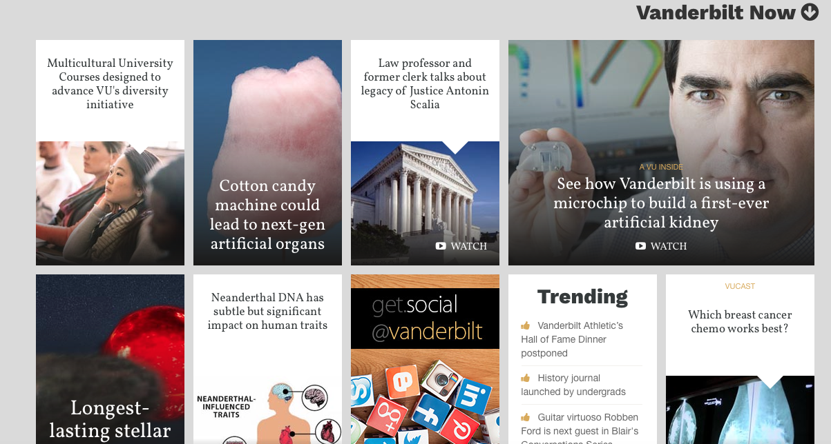
These hubs continue as the reader scrolls down, however they are not overwhelming or irritating to navigate. A great way to involve the reader is to show hubs of various aspects of campus such as housing, athletics, and academics. Several university websites even have hubs that constantly update with social media that use their hashtag. As you can see, these hubs can have a great combination of images and text. Images are key to captivating the reader, so blending your hubs with image and text is a must.
3. Streamline the Website
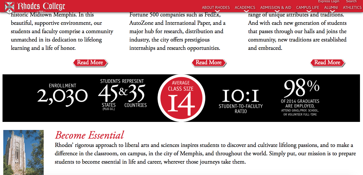
To me, the most important aspect of a university website is that it is driven by the strategy and goals of the university. Oftentimes the information provided may be informative, but how it is presented it imperative to catching the interest of readers. We love to experience aesthetically pleasing websites, and cluttered, unattractive information is a deterrent. For example, even though Rhodes may be posting great content, its delivery is not streamlined and appealing, and this screenshot is doing it justice (for a better look go to https://www.rhodes.edu). A major aspect of this lies in the details. Varying font sizes, where the information is located, and following a general website structure are important aspects of streamlining the website to make the website more appealing to the viewer, regardless of who you are trying to target.
4. Don’t be ‘too cool’
Contrary to what you might think, making a college or university website ‘too cool’ can work against you. As the premium for a college/university education continues to grow, many students are aware that they will be paying large sums of money and taking on debt in order to pay for their education. If the website is too flashy or lacks substantial material, it can be a turnoff to students. A great way to avoid this can be having the current students do the talking. For example, Furman University did a lakeside chat where current students answered questions live for several hours one night. This is an organic way for prospective students to interact with prospective students and learn about the university. This can also be done through a university promotional video. Look at this video from Miami University.
It has a great balance of fun student activities and academics.
Whether it’s creating the experience, developing content hubs, streamlining the website, or managing the ‘cool’ factor of your higher education website design, these four tips can add value to your site. An effective college or university website is a place where it is effortless to engage the viewer and draw them into your content. Improving these four aspects of your website will make your college or university website more appealing to visitors, and will draw them into interacting with your content. I found that navigating a wide variety of websites gave me a great understanding of what I liked and and allowed me to notice what I didn’t like in my university’s website. Use these for tips, get started now, and see the results that come from improving your website.
John Gleason – Content Creator
Created in partnership with Furman University.