How to Do a DIY Website Audit for Your Small Business
As 2015 wraps up, it’s time to set your marketing goals for 2016. With over 3.2 billion using the Internet, it’s likely that some of those goals will directly relate to your digital marketing efforts, especially your website.
However, if you’re like most small business owners I know, you’re barely keeping your head above water when it comes to online marketing. Sure, you have a website, but you haven’t looked at it since it launched or maybe you know it needs to be updated, but you aren’t sure where to start or what to change. This is when an audit can be extremely insightful.
Those who are a little more web savvy will benefit from utilizing Google Analytics to track and review their most successful content. But if that sounds too overwhelming for you and your budget won’t allow you to hire outside help, you can complete a simple audit on your own.
It’s always easier when you have an example to follow, so I teamed up with my husband, a web designer and developer, to do a quick, surface audit of a small local business’s website. We saw three areas where the business could improve their website.

Brand Consistency
One of your main goals for marketing materials should be to ensure that your brand is correctly reflected, that consumers aren’t confused about who you are and what you do. We saw two areas of the website that could cause brand confusion: the domain name and the absence of a logo.
The current domain is www.upstateuppercervical.com while the business’s actual name is Upstate Specific Chiropractic. Exact match domain names are harder to procure now, so if your business’s name is unavailable, you may have to settle for a version that is slightly different. However, our research shows that there is an exact match available for this website. Owning your company’s exact match domain may not seem important as you’re starting out, but it can lead to issues down the road. So if it’s possible to use it, do it. In this case, the business would need to purchase the exact match domain, move the website and set-up redirects.
The second thing we noticed was the absence of the business’s logo on the website. In fact, once you navigate away from the home page, the name of the company doesn’t appear on the website at all. Again, you want all marketing materials to tell the same story so the customer never questions where they are or what they are reading. This can be easily fixed by adding the logo to the top left-hand box and having it remain there on all pages.
Robust Content
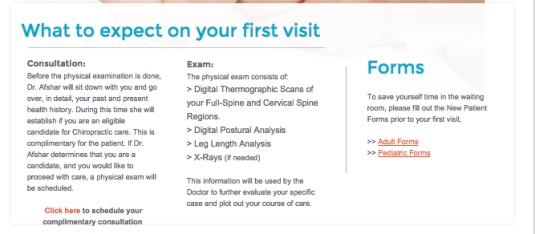
Another (huge) aspect to consider is the content on your website. Don’t overthink this area, though. Review your current content and consider if it answers the most common consumer questions – the who, what, why, how, when and where.
The current website has minimal copy, but it does an adequate job of answering the who (Meet the Doctor), the how (New Patient), and the where (Contact Us). The business can easily address the question of when by adding opening hours to their contact page. Responding to the what and why will take a little more time and thought, but a good place to start would be the addition of a services page that includes easy-to-scan information about the type of care the doctor provides and why it’s important. When reviewing the website, we discovered that the company had sponsored a blog post (on another website) that actually addressed these queries really well, so re-creating that content for their own website shouldn’t be too difficult since they already have some of the answers.
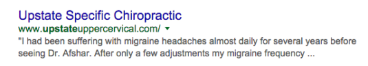
When you’re reviewing your content for potential holes, don’t forget to evaluate your meta descriptions and meta titles. This particular website has no meta descriptions, which means Google gets to choose what shows on the SERP. Because the business has included a review (a great idea!) in the front page copy, that’s what is pulling to the SERP. But I’d wager this is one of the few examples you’ll find where a business doesn’t have meta descriptions but still has compelling content on the SERP. It’s always better to tell Google what to look at, rather than having them guess. This is the first content your user will see about your business after searching for it, so spend a little time crafting a meta description that will entice your consumer to click through and learn more about your product.
![]()
This website is also missing meta titles, so when you click through the website, the only thing that appears in the browser tabs are the names of the pages: Home, New Patients, etc. If a user only has one website open, meta titles don’t seem that important. But, most of us are usually doing 10 different things, maybe even comparing products or services of multiple businesses, at the same time. So adding meta titles that help distinguish your company’s website from others that may be open in the same browser will ensure your website isn’t lost in the mix.
Visual Simplicity
When you’re studying design, one of the first things you learn is practicing restraint. It’s very easy to become excited about all the possibilities and end up doing too much in a very small space. You never want your design to distract from your content, so restraining the desire to “do more” is essential.
On this website, we noticed several design choices that could be simplified: font, color and navigation. We would recommend choosing one or two fonts for the entire website and using them in the same places. For instance, all navigation and headers are in font #1 and all body copy is in font #2. If you never studied typefaces (and who can judge you), Font Pair is a great resource for choosing fonts that work well together. Once your fonts are selected, avoid the urge to randomly color, bold or enlarge the fonts. Keep it simple.
Similarly, the colors on your website need to be consistent and appear intentional. While it’s completely fine to have multiple colors, you want to be certain the colors complement one another and reflect any colors you already use in branding items like your logo. Right now, there are about seven or eight colors on the website, none of which exactly match the three colors in the business’s logo. Because of this, we would update and simplify the current color scheme to align with the logo. Check out Coolors if your logo doesn’t have colors and you need help determining a color scheme.

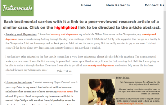
For a small website, you want a straightforward navigation that doesn’t confuse your users and allows them to easily navigate from page to page. This website has a main menu at the top and a footer navigation. However, these two site menus don’t align; the main navigation does not include two important pages: Meet the Doctor and Testimonials. Since these two pages answer the who and some of the what and why, we would absolutely want these in the main navigation at the top. Once the key pages are moved to the top, the footer navigation is no longer necessary and can be removed to further simplify the design.
Obviously, if you are working within a template, some of these items may be beyond your control. But if the template or theme doesn’t align with these suggestions, it’s probably time to find a new template – one that enhances your message instead of distracting views from it.
We hope this exercise helps you get closer to a better, more effective website. But, if you have questions or are interested in receiving a professional audit, please reach out to us!
Enjoyed this post? Read more from Faith!
Faith Jones—Writer & Editor